I manage both UX/UI design and website development for Arkis. I create new Framer pages for the website, develop visual assets for social media, and support the marketing team with product decks, presentations, and whitepapers.
The website underwent a full redesign in February 2026. This case study highlights the earlier version and the contributions made before the update.

Contribution
UX/UI Design
Website development
Visual Design
This page showcases how Arkis approaches risk management and displays all whitelisted assets in one place. It gives users a transparent overview of the tokens that can be used within the Arkis ecosystem.
My responsibility was to design the page and develop it in Framer. I created an initial wireframe to define the page structure and information hierarchy, then refined it through feedback from the team.
Based on the approved wireframe, I designed the final UI using Arkis’s existing brand style and built the page in Framer. It is now live and updated regularly as new assets are added.


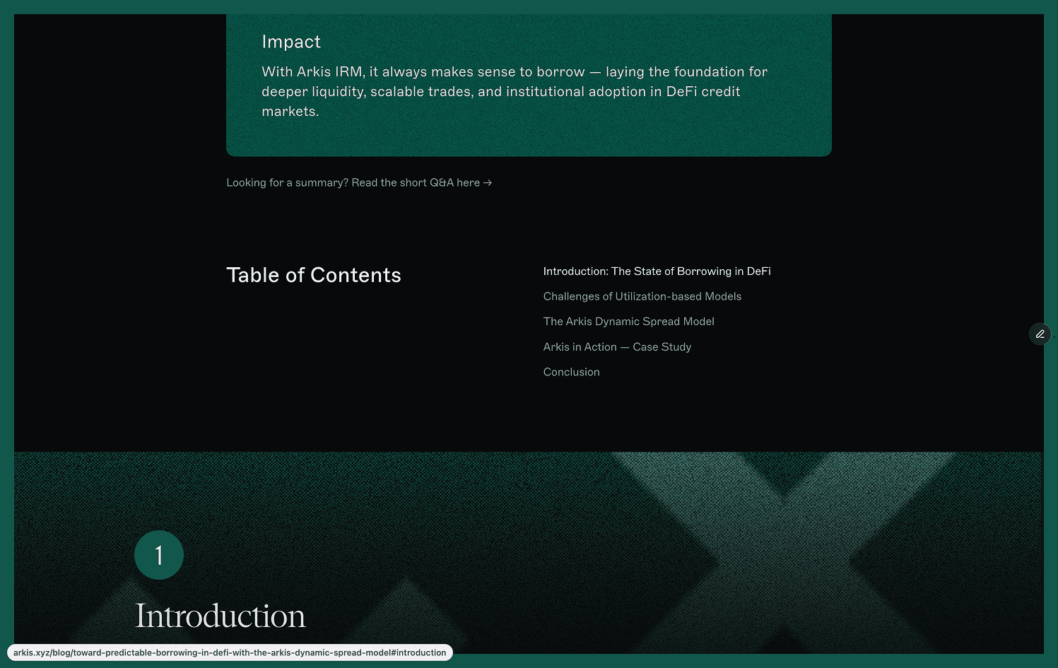
The longread explains how Arkis is making borrowing in DeFi more predictable and setting new industry standards. It builds trust with future borrowers by clearly presenting how the Arkis Dynamic Spread Model works and how users can benefit from borrowing through Arkis. My role was to create a longread format that turned this complex content into a clear, engaging reading experience.
Arkis already had an established blog design, but this article required a different visual approach. Because it is a high-impact piece, the layout needed to stand out from regular posts, feel more engaging, and emphasize the value Arkis brings to borrowers. I created a custom longread format, designed the layout, and developed the page in Framer. The structure highlights key ideas, supports complex explanations with visuals, and makes the content easier to navigate and explore.
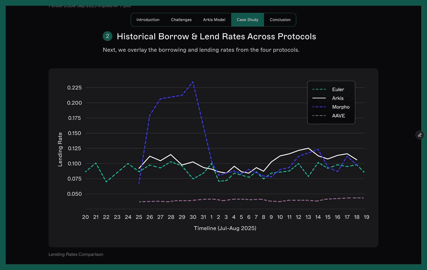
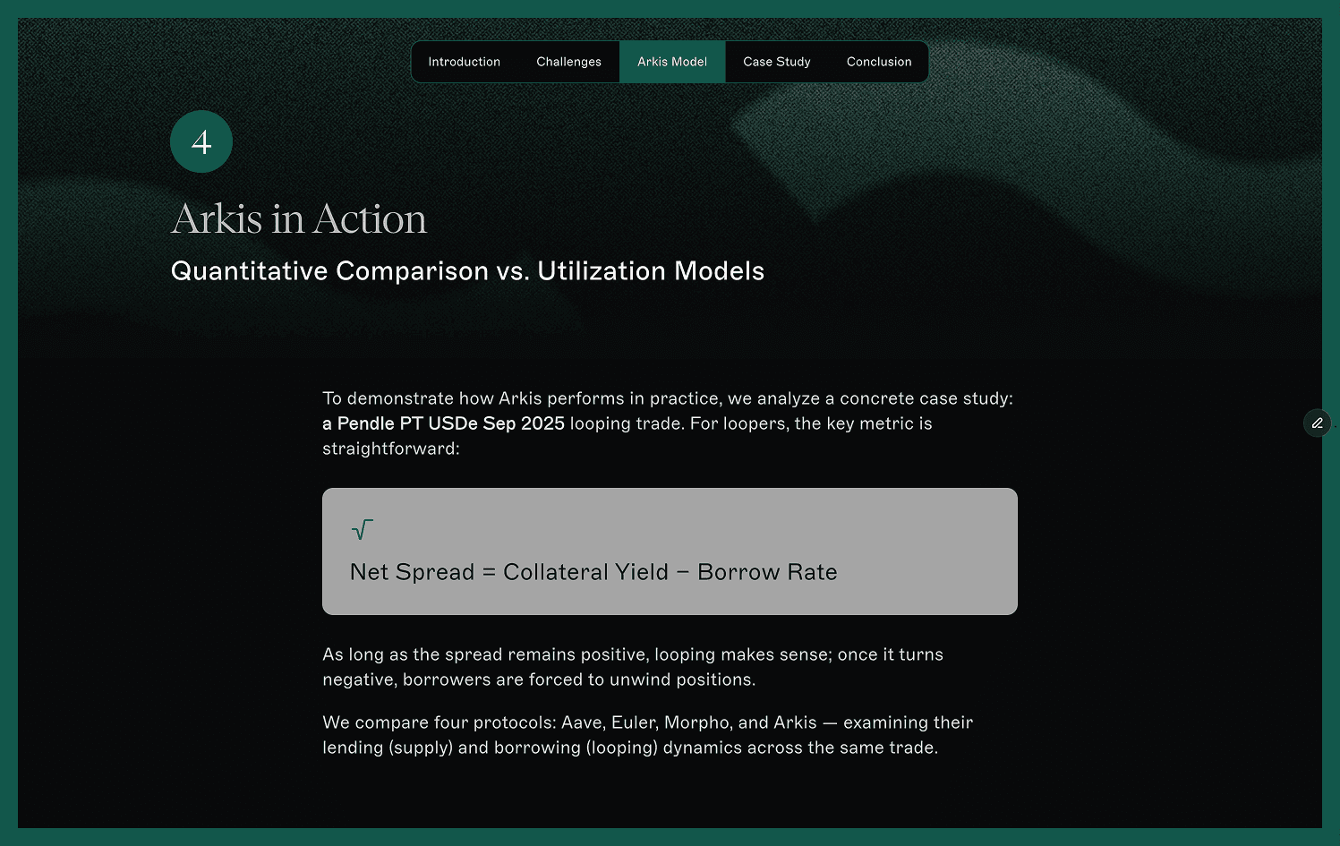
Because the article covers a complex topic, it was intentionally long. The challenge was to make it easy to both read and scan, keeping users engaged throughout. To achieve this, I added a TL;DR section in the beginning, a table of contents, and a persistent navigation bar that lets readers jump between chapters. I also designed distinctive headings, highlighted core ideas and conclusions, and worked with the author to support explanations with graphs and visual callouts.


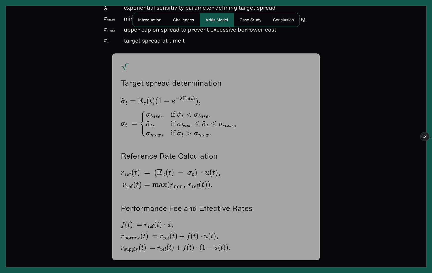
The article includes a large number of graphs and formulas, which are essential for illustrating key points but risk becoming repetitive. I developed a consistent visual style for all graphics while introducing subtle variation to maintain rhythm and avoid visual monotony.


Finally, I designed the layout and developed the page in Framer within a short timeline, making sure it works smoothly across devices.
Social media visuals
As part of my work with the marketing team, I design visuals for Arkis’s social media channels (X and LinkedIn) to showcase product updates and simplify complex DeFi concepts. The selected works below show a portion of the assets I create for ongoing campaigns and announcements. These visuals strengthen brand visibility and help the team communicate more effectively with our audience.
I also design visuals for newsletters and marketing decks, maintaining consistency across all marketing content.